
© DaColony 2021 ![]() All rights reserved
All rights reserved
© DaColony 2021 ![]() All rights reserved
All rights reserved
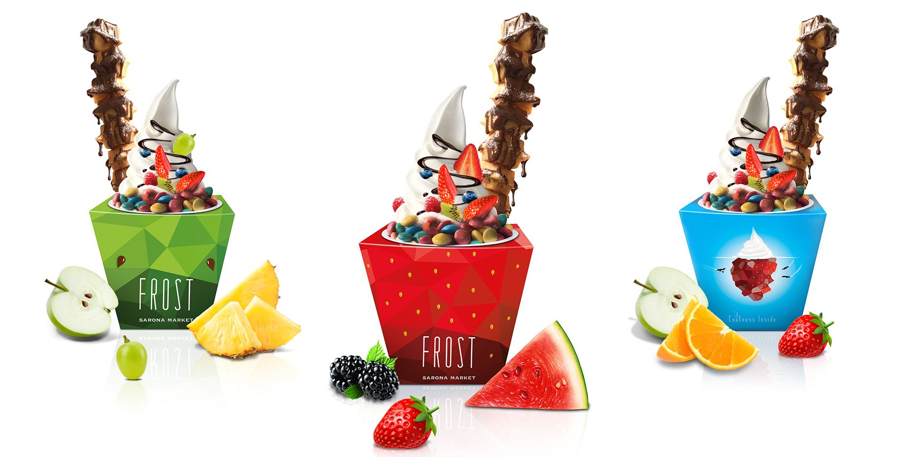
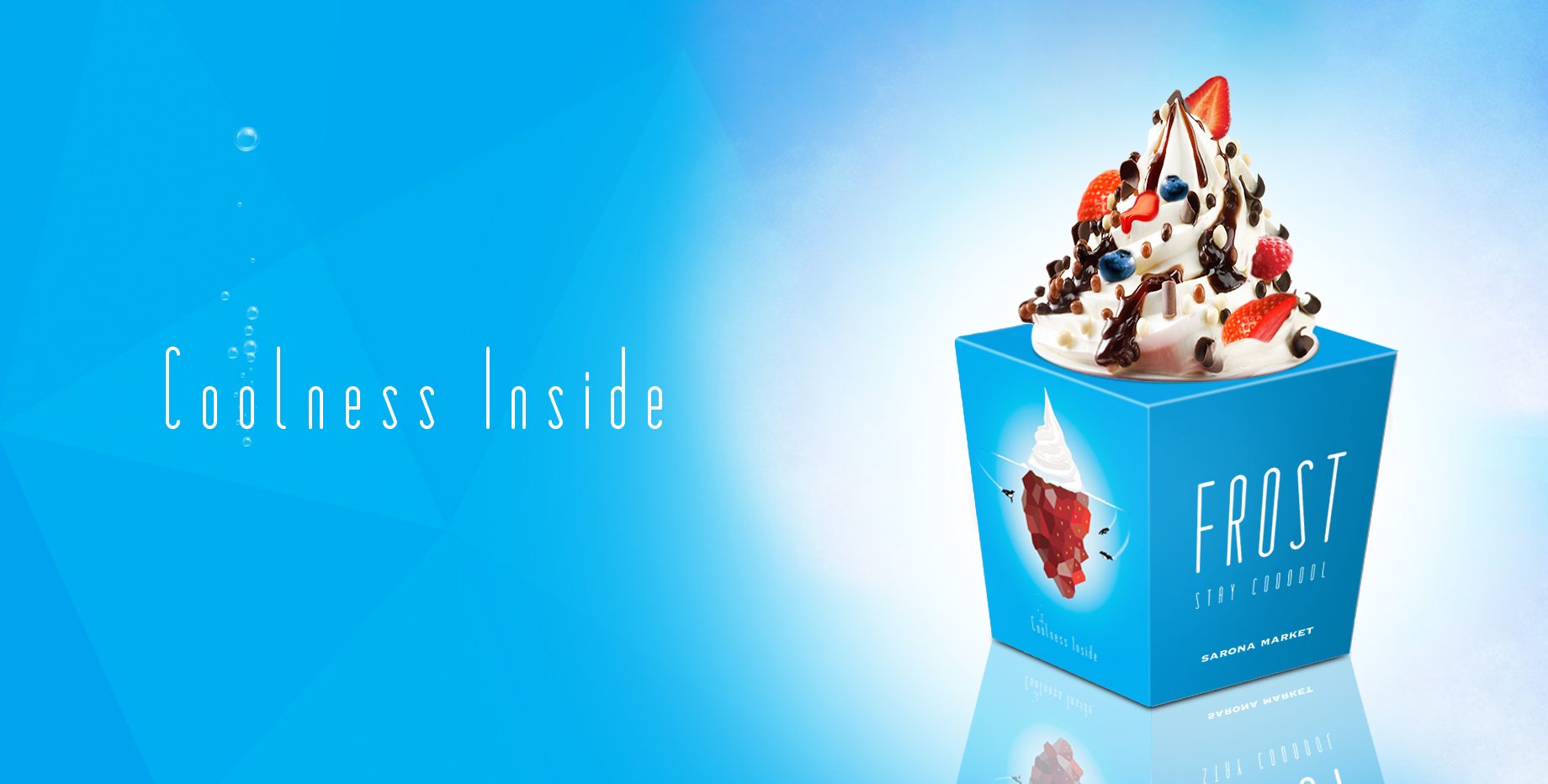
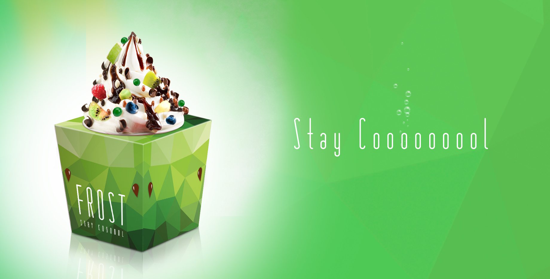
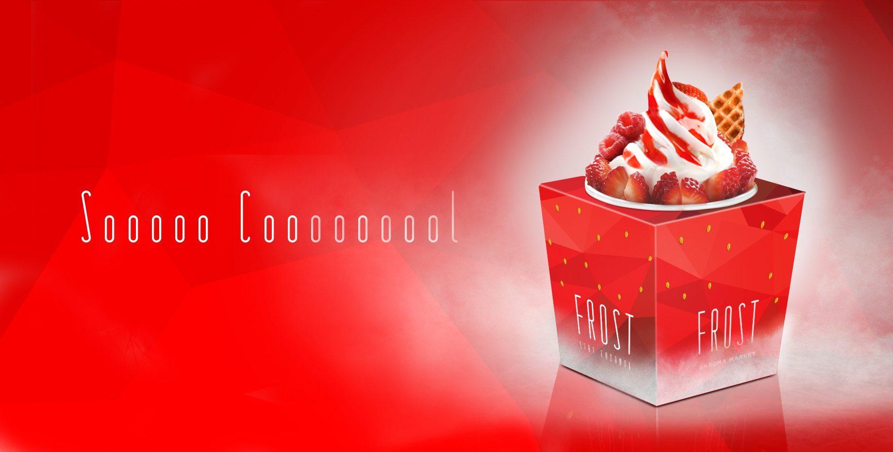
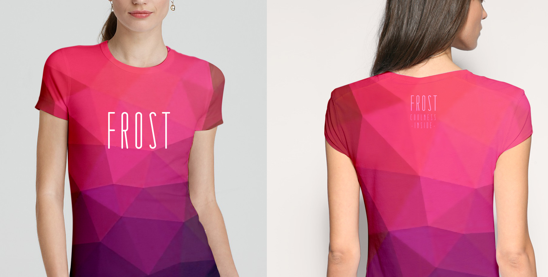
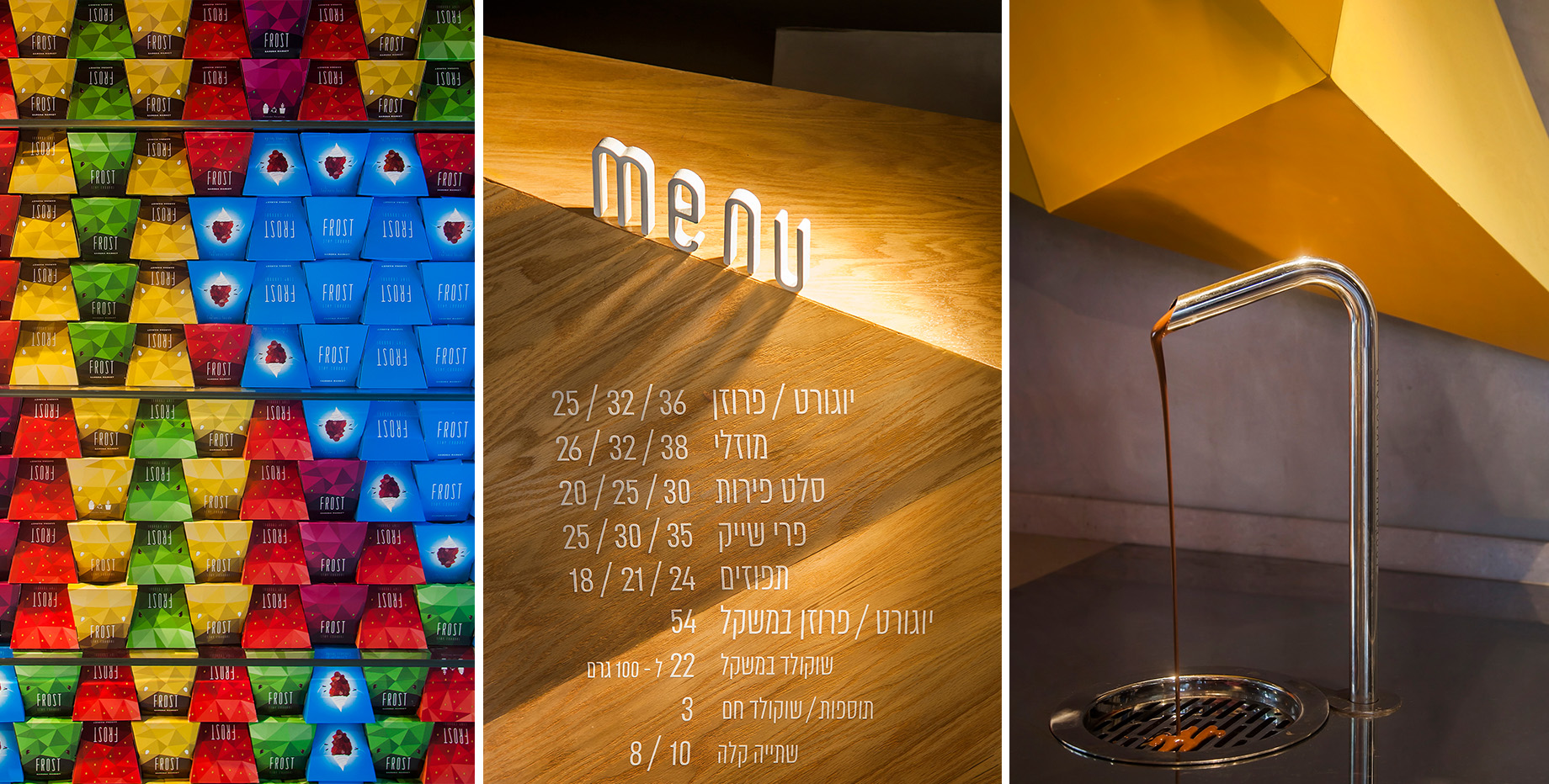
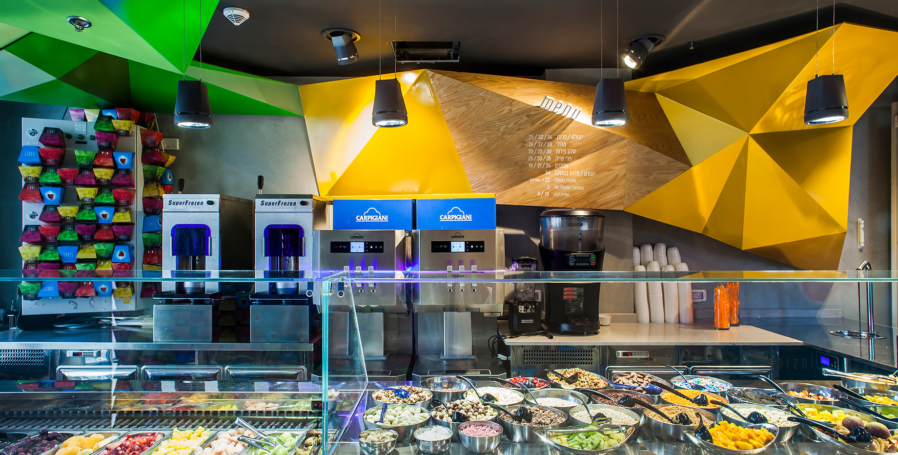
‘frost frozen yogurt bar’ is located in the trendy Sarona Market, tel aviv. Da Colony was requested to develop a whole new brand from scratch, starting with the brand strategy, brand identity, naming and wholistic product development. The brand’s name and visual language were developed around the immediate context of the main product, the frozen yogurt.Hence the name given to the brand:”Frost”.The branding and graphic language is directly in line with the subject:Ice crystallization.The main images consist of crystallized fruit, giving the brand a unique, stand out look that is in fitting with the product. Resulting with an unusual, young, light, colorful & fun brand appearance in it’s category.
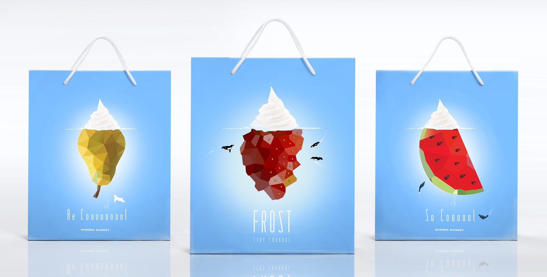
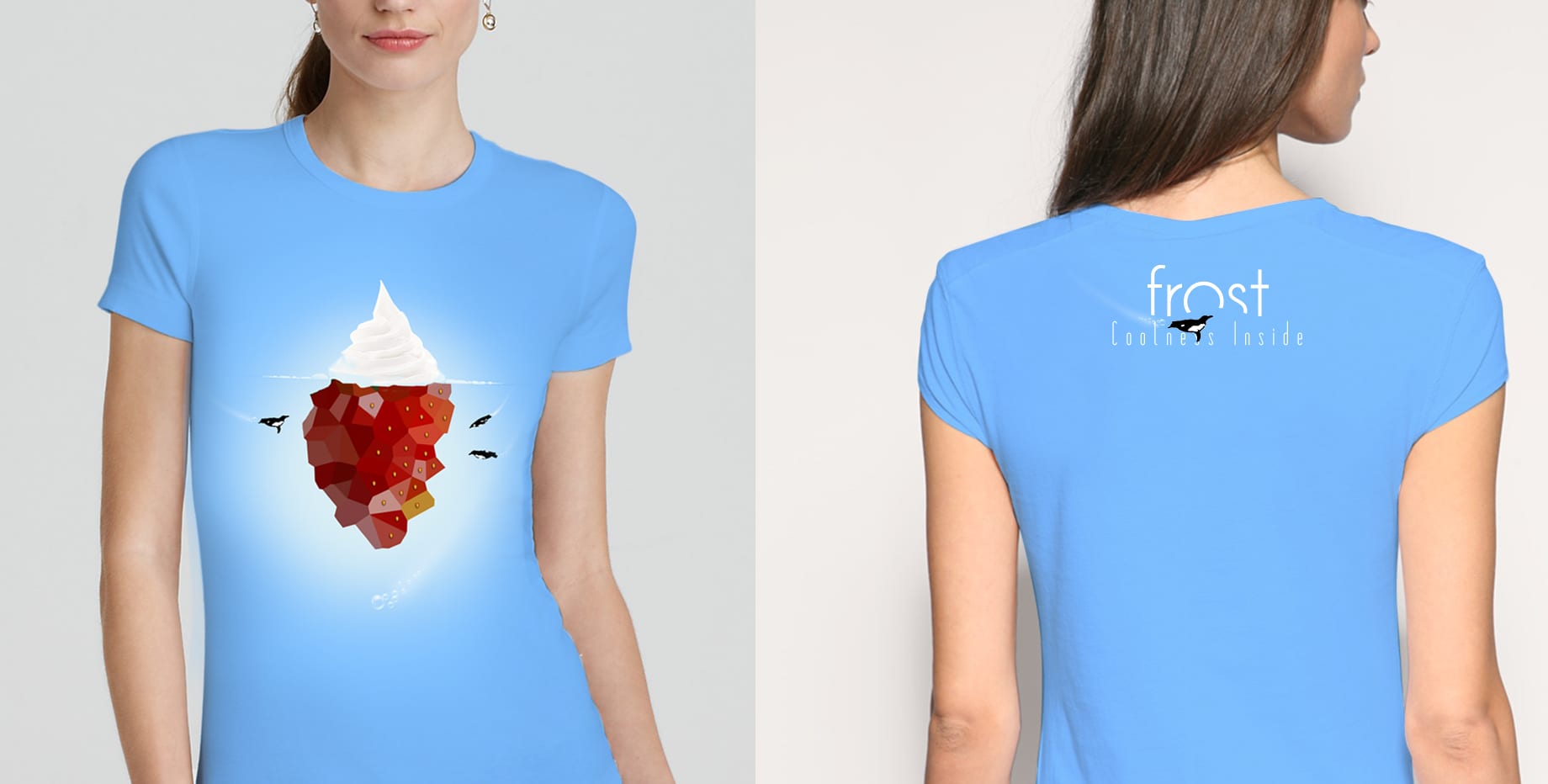
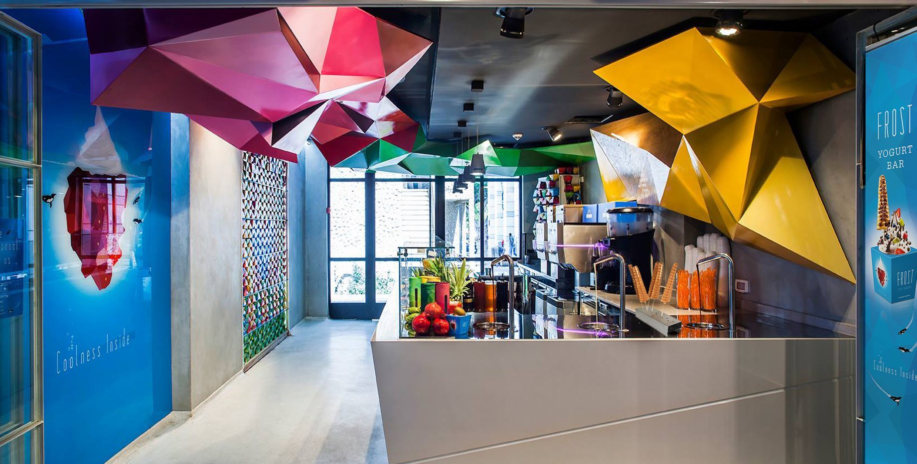
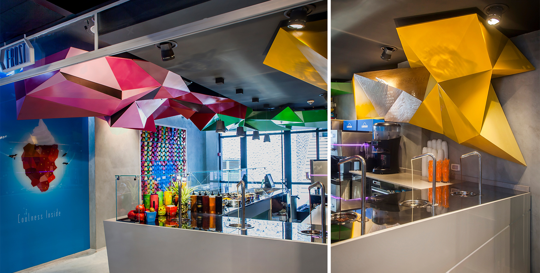
Da Colony’s challenge was to come up with a unique concept that relates to the product, tells a story and stands out. The main graphic language elements chosen for the brand were “polygons”. The complex shapes that look like the formation of crystallized ice / icebergs, were most suitable for the creative concept, allowing the brand story development in many ways and on a variety of applications and interior design.The result is a concept wrapped around the frost effect, from the glaciers in macro, to ice crystallization in micro.The graphic language is diverse, rich, colorful, fun, dynamic and tasty. It gives the brand an attractive and unique look and feel, with a whole lot of character and differentiation in its category.
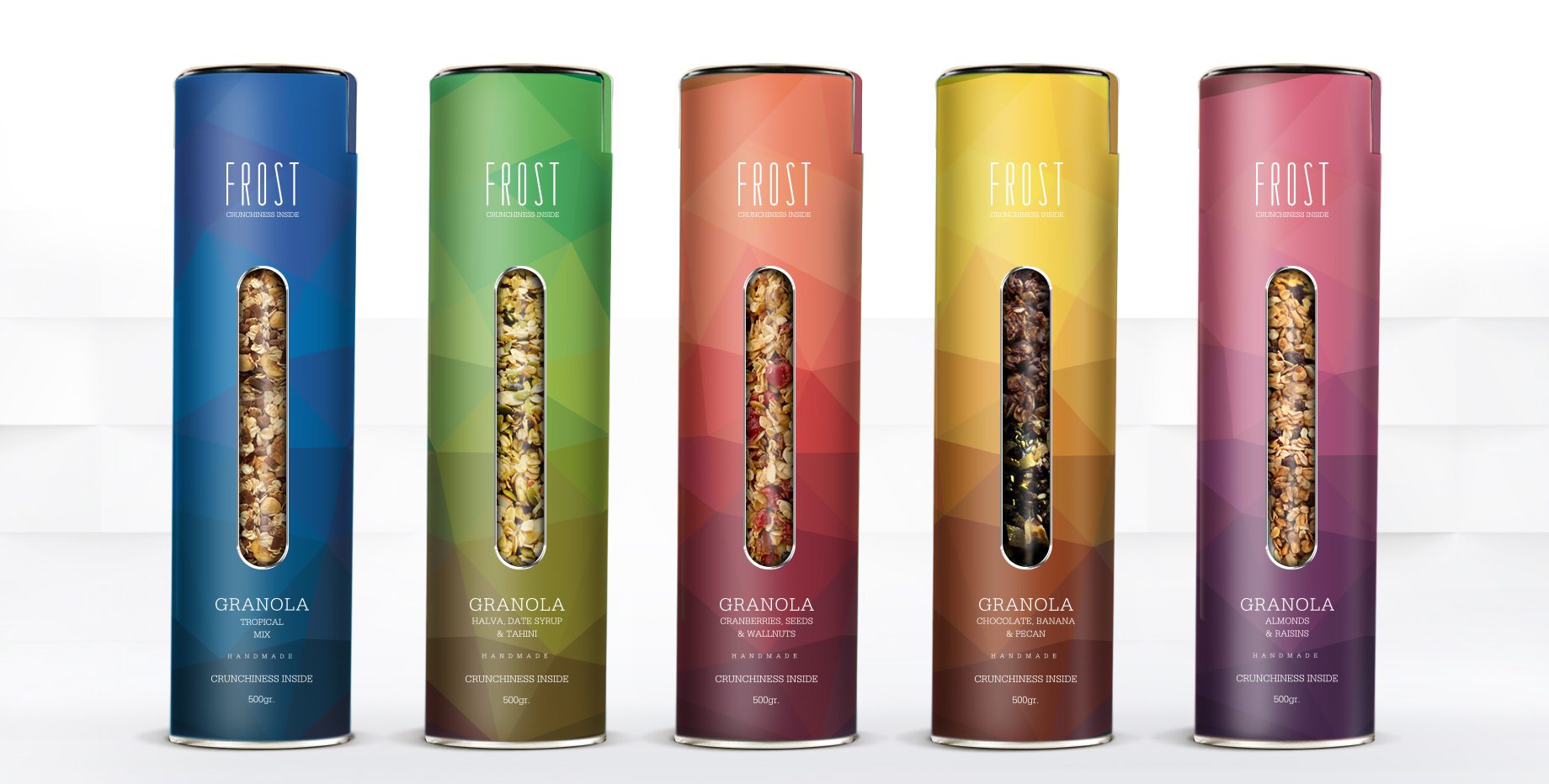
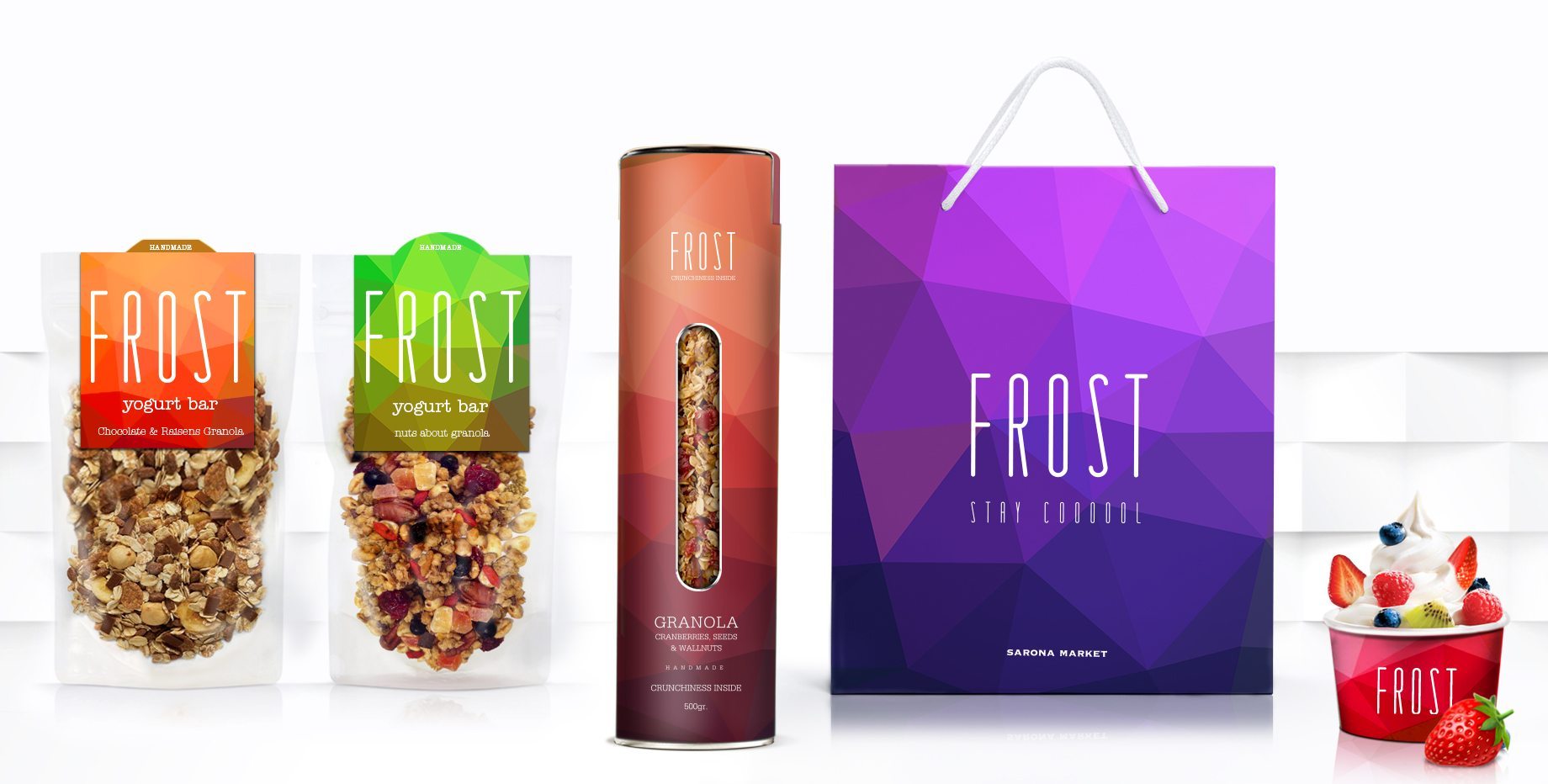
‘frost frozen yogurt bar’ is located in the trendy Sarona Market, tel aviv. Da Colony was requested to develop a whole new brand from scratch, starting with the brand strategy, brand identity, naming and wholistic product development. The brand’s name and visual language were developed around the immediate context of the main product, the frozen yogurt.Hence the name given to the brand:”Frost”.The branding and graphic language is directly in line with the subject:Ice crystallization.The main images consist of crystallized fruit, giving the brand a unique, stand out look that is in fitting with the product. Resulting with an unusual, young, light, colorful & fun brand appearance in it’s category.
Da Colony’s challenge was to come up with a unique concept that relates to the product, tells a story and stands out. The main graphic language elements chosen for the brand were “polygons”. The complex shapes that look like the formation of crystallized ice / icebergs, were most suitable for the creative concept, allowing the brand story development in many ways and on a variety of applications and interior design.The result is a concept wrapped around the frost effect, from the glaciers in macro, to ice crystallization in micro.The graphic language is diverse, rich, colorful, fun, dynamic and tasty. It gives the brand an attractive and unique look and feel, with a whole lot of character and differentiation in its category.
© DaColony 2021 ![]() All rights reserved
All rights reserved